
Reports vs. Presentations: A Tale of Two Data Sources
Reports vs Presentations: A Tale of Two Data Sources
Have you ever thought about why you deliver a presentation versus sending a report? Let’s face it – reports are easier. They don’t require coordinating schedules or reserving meeting spaces and preparing information for reports is far less labor intensive than pulling together the content required for a quality presentation.
What Makes a Report
Generally, reports provide data that keeps us updated. They repeat the same metrics to show fluctuations and allow for minimal interaction with the data. A column sort or a filter is usually all you get. The information provided is meant to be observed and isn’t generally a catalyst for change in and of itself. That’s because if a report shows a trend that requires action, more information is typically needed before a plan takes shape. That information comes in the form of context, additional data points, comparisons, benchmarking, recommendations and sometimes predictions.
What Makes a Presentation
On the other hand, presentations give an audience something from which to react. They take facts and figures and make them relatable. They “connect the dots” so that the journey from problems to solutions can be tracked and guided with supporting data points. When businesses face challenges, solutions rarely arise from an email exchange of facts and figures. Solutions are born from conversations and presentations generate conversations. So why does it seem that we all have inboxes full of reports, but presentations are doled out in calculated measures like annual or quarterly customer meetings?
It’s no small task to pull together a quality presentation – especially a quality data presentation. Collecting the data, finding relationships within the data, generating conclusions and applying context from that data is no easy feat. Beyond that, translating it into visuals that leave the audience with clear directives (actions) means that data presentations often go undone.
Enter Data Products
But imagine if these obstacles were removed. In our last blog we defined data products, their applications, and the insights they can provide. Data products or apps offer an opportunity to frequently generate and share data more akin to a presentation than a report. To truly have an impact similar to that of a live presentation, a data product needs to accomplish several things. Here are three ways a well designed data product moves information beyond a report and to a data presentation:
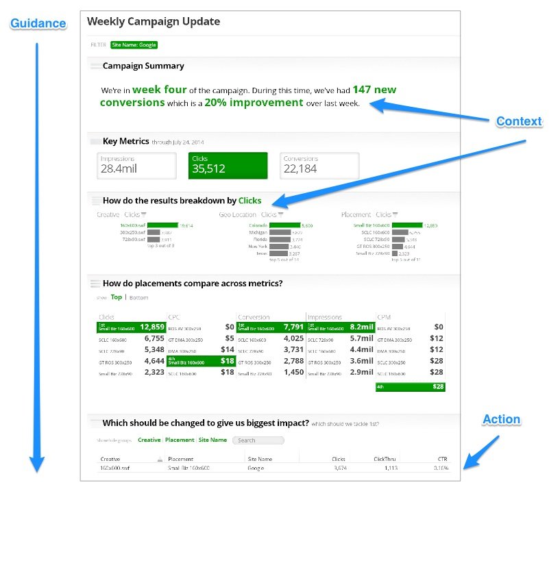
Guidance - Direct an audience where to start and the sequence they should consume the information. Presentations always start somewhere.
Context - Give an audience what they need to understand and buy in to the challenge and solution being shown. Using text to supplement your data and visuals always helps. Pose and answer questions.
Actions - Presentations end with recommendations, suggestions or next steps. Ultimately this should be a to do list that your audience walks away with.
Here is a basic example to illustrate guidance, context and actions. Note the sequence and readability.
http://slice-publish.s3-website-us-east-1.amazonaws.com/U4hXwF1s4gK/# (FLASH demo)
Contrast the display above with the Federal IT dashboard below.
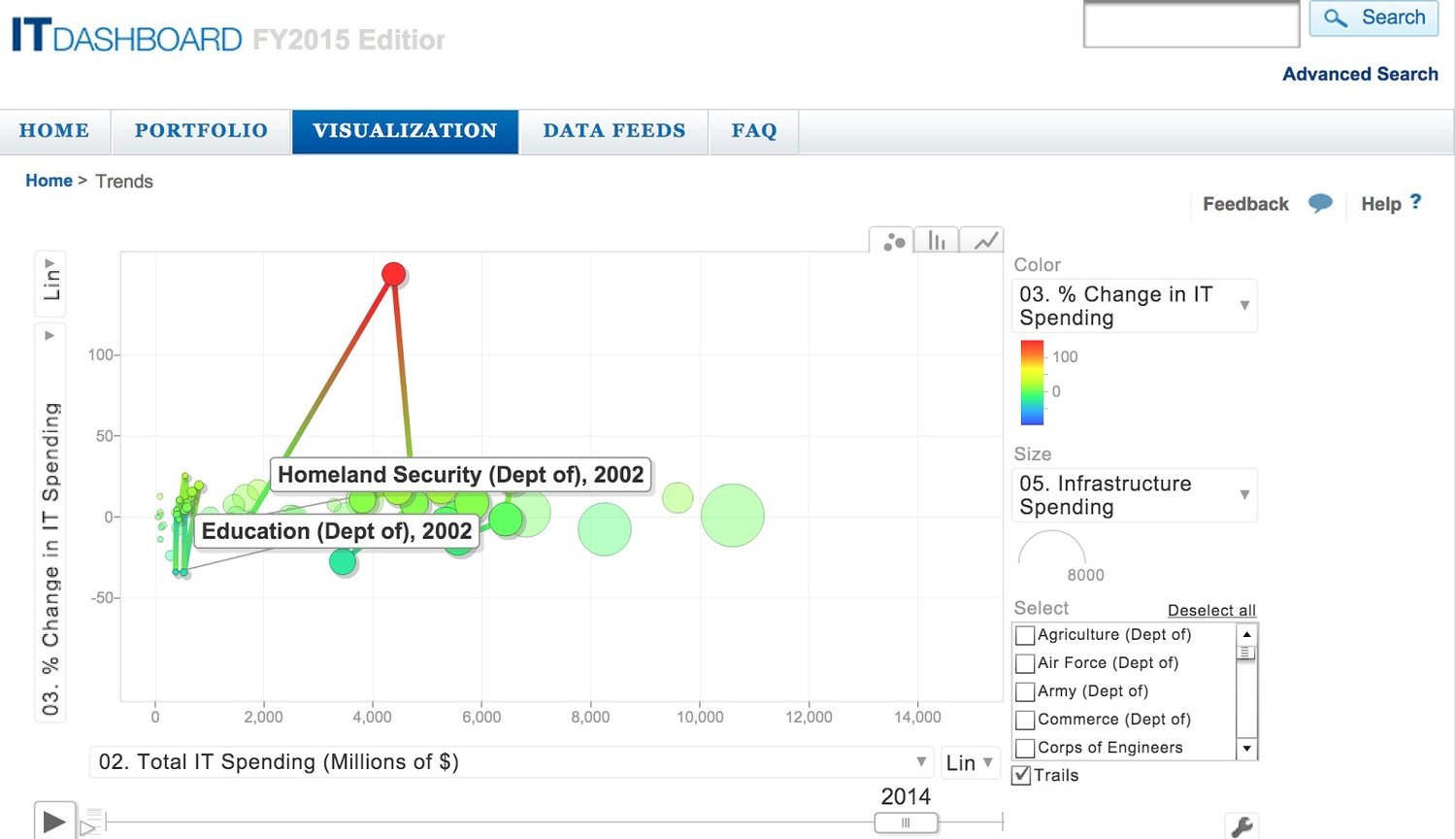
https://itdashboard.gov/trends
The Take-Away
What does all this mean? Sorry, PowerPoint isn’t going away anytime soon; however what it does mean is sharing data with presentation quality (guidance, context, actions) more often than we do today, particularly customers, is now within reach.
If you’re curious about how to transform your own data so that it can be shared with wider audiences, go ahead and request a Juicebox demonstration. We developed the platform with presentation quality delivery in mind.